


10 hours ago2 min read

What you need to Know
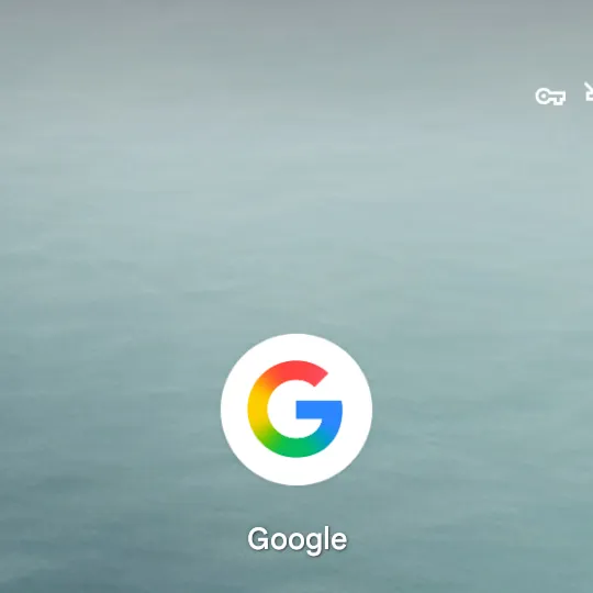
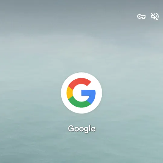
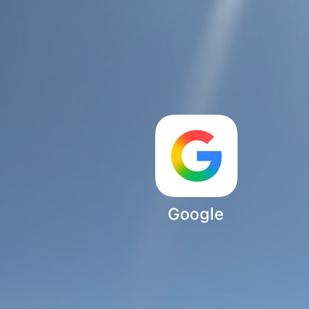
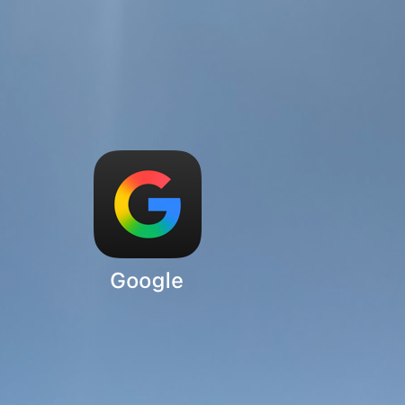
Google has updated its iconic “G” logo for the first time in nearly a decade.
The new logo uses a gradient blend of red, yellow, green, and blue colors.
This change first appeared in the Google app on iOS and Pixel devices.
The new design reflects Google’s modern direction, especially with AI integration.
This update marks a visual refresh that aligns with current design trends and AI advancements.

In a quiet but impactful gesture, Google has redesigned its legendary "G" logo for the first time in nearly 10 years and it's all about gradients! As originally reported by 9to5Google, the redesign has been seen in the Google app for iOS and Pixel devices. The updated logo is a silky combination of Google's classic red, yellow, green, and blue hues, shifting from a solid block form to a smoother, gradient effect. This lively refresh represents an even more contemporary look that better fits Google's changing visual brand particularly as the company heads further into AI-based experiences.
To appreciate the importance of this update, let's flash back on September 1, 2015, the last time Google significantly changed its branding. The technology giant at that time replaced its wordmark with a sans-serif font called Product Sans, introducing a neater, more contemporary design. Along with that rebrand, Google also debuted the round "G" logo a strong, four-colored symbol that took over from the earlier lowercase "g" on blue. This "G" would go on to become one of the most well-known symbols in technology.
Fast forward to the present, and Google is set for another visual revamp. The new "G" logo still retains its circular form but sheds the clear color blocks. It comes with a mixed gradient effect where red merges into yellow, yellow into green, and green into blue. It's a small change, but it makes the logo more dynamic and energetic in appearance, mirroring Google's foray into generative AI and cutting-edge design features.
This update isn’t just a design decision; it’s part of a larger visual alignment with Google's ongoing AI journey. The gradient style resembles that of Google Gemini’s branding, which has also adopted a colorful, flowing appearance. With features like AI Mode in Search, and Gemini-powered tools being integrated across Google’s ecosystem, the gradient logo feels like a natural evolution.
Actually, the new "G" logo is already visible in the Google Search application for iOS through the latest update, and rolled out to Android devices through the Google app version 16.18 (beta). Worth mentioning is that the switch may fly under the radar for many particularly when the icon quietly rests on a home screen or barely register as a small favicon in the browser. But the moment you see it, the bright gradient makes the original one look slightly. outdated.
Incidentally, Google's primary six-letter logo remains unchanged. The well-recognized "Google" wordmark still comes with solid colors, and the recent gradient update hasn't yet reached the web or all Android devices. Google hasn't officially declared if other key product logos, such as Chrome, Maps, or Gmail, will receive a comparable gradient makeover but it's definitely possible. These apps currently incorporate Google's four iconic colors, and shifting to a mixed format would ensure consistency of branding while giving things a new look.
Android app
iOS App
While this update may seem subtle to some, it represents a clear step in Google’s visual evolution, subtly nodding to the company’s broader ambitions in AI and machine learning. As design trends shift toward more fluid, natural, and expressive styles, this gradient "G" feels like a step into a more polished and intelligent user experience something we’re seeing across many of Google’s apps and services.
Whether you're a design aficionado, a die-hard Google fan, or simply someone who enjoys a good icon overhaul, this latest update is yet another reminder that even the smallest of visual changes can say a lot about where a company is going.


Comments